Day 11 (22/11/16): Type of “strange” occupancies
Looking at the dataframe of unusual occupancies from yesterday, I’ll put each record into one of four categories, in order to more easily see which records are definitely wrong, which are questionable, etc.
```rtype <- vector(“character”, nrow(df3))
type[df3\(Occupancy == 0] <- "Zero" type[df3\)Occupancy < 0] <- “Negative” type[df3\(Occupancy == df3\)Capacity] <- “Full” type[df3\(Occupancy > df3\)Capacity] <- “Overfilled”
df3$Type <- factor(type, levels = c(“Overfilled”, “Full”, “Zero”, “Negative”))
p <- ggplot(df3, aes(x = LastUpdate, y = ““)) + geom_point(aes(colour = Type)) + facet_wrap(~ Name, nrow = 4) + scale_colour_manual(values = rev(c(”red”, “black”, “green”, “blue”))) + ylab(““) + ggtitle(”Type of "Strange" Occupancies”) + theme(plot.title = element_text(size = rel(1.5)))
p<img src="day11.jpeg" /> <p>We can see, for example, that all the definitely-wrong negative-occupancy records are from SouthGate General - maybe the council should look into upgrading the sensors there…</p> <hr> <h3>Day 12 (23/11/16): Hours of over- and negative occupancy</h3> <p>We had another Bath ML Meetup tonight - we didn’t have too long to talk about the project, but plans are being made…</p> <p>Using the dataframe from yesterday, I’ll have a quick look at when the particularly dubious records - the overfilled and negative records, that is - are generally recorded. I’m curious as to whether, for example, overfilled records are more common at lunchtime than overnight.</p>rdf4 <- filter(df3, Type == “Overfilled” | Type == “Negative”) %>% mutate(Time = hour(LastUpdate) + minute(LastUpdate)/60)
p <- ggplot(df4, aes(x = Time, y = ““)) + geom_point(alpha = 0.01) + facet_wrap(~ Type, nrow = 2) + scale_x_continuous(breaks = seq(0, 24, 4)) + ggtitle(”Hours of over- and negative occupancy”) + ylab(““) + theme(plot.title = element_text(size = rel(1.5)), panel.background = element_blank())
p<img src="day12.jpeg" /> <p>As it turns out, the overfilled records are spread over the whole day, with a decrease only in the early morning. Negative records tend to be from overnight, although there are some during the day too.</p> <hr> <h3>Day 13 (24/11/16): Spread of negative occupancies</h3> <p>I’m wondering how the negative occupancies are distributed - we’ve seen that there are some very large negative values, but I’m curious as to how many of these there are, compared to more modest values. My reasoning here is that there are probably a lot of small negative values due to physical, quickly-resolved sensor errors, and then fewer very large negative values due to errors in the uploading of data or some other issue.</p>rdf4 <- filter(df3, Type == “Negative”)
Having sneakily looked at plot already, I’ll points in certain ranges
counts <- c(tally(filter(df4, Occupancy < -10000))[2], tally(filter(df4, Occupancy >= -10000, Occupancy <= -1000))[2], tally(filter(df4, Occupancy > -1000))[2]) %>% sapply(sum)
p <- ggplot(df4, aes(y = ““, x = Occupancy)) + geom_point() + ggtitle(”Spread of negative occupancies”) + ylab(““) + annotate(”text”, x = c(-14500, -2000, -100), y = c(rep(1.2, 3)), label = counts)
p<img src="day13.jpeg" /> <hr> <h3>Day 14 (25/11/16): Massively negative occupancies</h3> <p>Yesterday’s plot revealed a small cluster of points at around -15000. Let’s have a more detailed look at these points, and see if we can work out ‘how’ they are wrong - for example, if they are all the same value, which might suggest it is a deliberate ‘indicator’ value used by the council to denote a closed car park.</p>rdf4 <- filter(df3, Occupancy < -10000)
summary(df4\(Name)```
```rconsole## Avon Street CP Charlotte Street CP Lansdown P+R
## 0 0 0
## Newbridge P+R Odd Down P+R Podium CP
## 0 0 0
## SouthGate General CP SouthGate Rail CP test car park
## 26 0 0```
```rrange(df4\)Occupancy)rconsole## [1] -14787 -14638rtime_length(max(as.double(df4\(LastUpdate)) - min(as.double(df4\)LastUpdate)), unit = “hour”)rconsole## [1] 0.02361111<p>So all of the points in this group are from SouthGate General CP, they span a range of values, and they were all recorded within a 2-hour period. Let’s have a look at the trend of these records.</p>rp <- ggplot(df4, aes(x = LastUpdate, y = Occupancy)) + geom_line() + ggtitle(“SouthGate General CP: Occupancy on 05/01/2015”) + xlab(“Time”)
p<img src="day14.jpeg" /> <p>According to the records, the car park is emptying over this period - but the difference between 13:30 and 15:30 is only around 150 cars, which is a reasonable change over that period of time.</p> <p>Perhaps there was an unexplained, but precise, shift of -15000ish in the Occupancy records for this brief 2-hour period - in which case the data might be salvageable…</p> <hr> <h3>Day 15 (26/11/16): Trend of massively negative occupancies</h3> <p>Let’s see whether the records from that strange Monday afternoon last January follow the trend of records from a typical Monday afternoon.</p> <p>First I’ll take all the records from Mondays <em>except</em> for 05/01/2015 between 13:00 and 15:59, and average them out.</p>rdf2 <- select(df, Name, LastUpdate, Occupancy) %>% filter(Name == “SouthGate General CP”, Occupancy >= 0) %>% filter(wday(LastUpdate) == 2) %>% mutate(Time = update(LastUpdate, year = 1970, month = 1, day = 1)) %>% mutate(Time = round_date(Time, “10 minute”)) %>% filter(hour(Time) == 13 | hour(Time) == 15) %>% group_by(Time) %>% summarize(newOcc = mean(Occupancy)) %>% mutate(Period = “Average”)<p>Now I’ll get the dodgy records from 05/01/2015, shift them by adding a constant to each (initially 15000 - an educated guess), and combine these in a dataframe with the averaged records.</p>rk <- 15000
df3 <- select(df, LastUpdate, Occupancy) %>% filter(Occupancy < -10000) %>% mutate(Time = update(LastUpdate, year = 1970, month = 1, day = 1)) %>% mutate(newOcc = Occupancy + k) %>% select(Time, newOcc) %>% mutate(Period = “05/01/2015”)
df4 <- rbind(df2, df3)<p>Now let’s plot!</p>rp <- ggplot(df4, aes(x = Time, y = newOcc)) + geom_line(aes(colour = Period)) + scale_fill_discrete(guide = guide_legend()) + ggtitle(“SouthGate General CP: Adjusted”) + ylab(“Occupancy”) + annotate(“text”, x = (max(df4\(Time) - 1500), y = (min(df4\)newOcc) + 80), label = paste0(“Shift: +”, k))
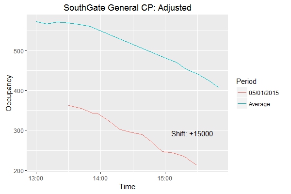
We can see that the shifted records do indeed follow the same pattern as the averaged records. A small adjustment to k confirms this.
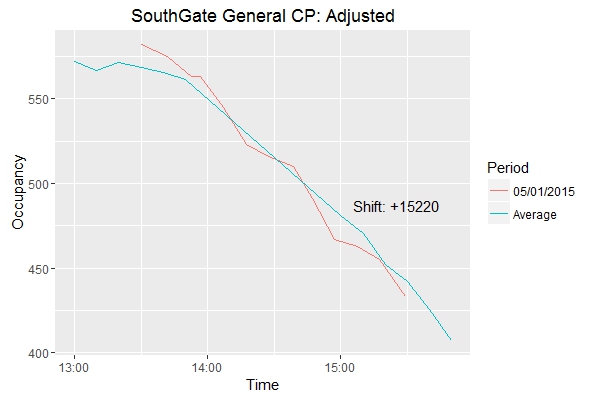
Maybe I can find a better value for this constant if I have a look at the records leading up to and away from the massively-negative period…
On another note:
WOOOOOOAH, I’M HALFWAY THERE!
To be completely honest, when I started this project just over 2 weeks ago I didn’t know how I would even get this far without running out of ideas. Here’s hoping I can keep it up for another 15 days!