Day 16 (27/11/16): Shifting massively negative values
As a culmination of the effort of the last few days, let’s see if the shifted values line up nicely with the unaffected values from that day.
I’ll keep my guess of 15220 for the shift k from yesterday for now.
```rtimerange <- interval(ymd_hms(“2015-01-05 10:00:00”), ymd_hms(“2015-01-05 18:00:00”))
k <- 15220
df2 <- select(df, Name, LastUpdate, Occupancy) %>% filter(Name == “SouthGate General CP”) %>% filter(LastUpdate %within% timerange) %>% arrange(LastUpdate) %>% mutate(newOcc1 = ifelse(Occupancy < -10000, Occupancy + k, Occupancy))<p>I can actually check whether my guess for k is reasonable fairly easily - I’ll find the largest changes in occupancy, and then average them.</p>rrng <- range(diff(df2$Occupancy)) mean(abs(rng))rconsole## [1] 15219.5<p>It turns out my guess was actually very reasonable indeed!</p> <p>OK, let’s try plotting the corrected occupancies on top of the correct records.</p>rp <- ggplot(df2, aes(x = LastUpdate, y = newOcc)) + geom_path(aes(colour = (Occupancy < -10000))) + ggtitle(“Adjustment of massively negative occupancies”)
p<img src="day16.jpeg" /> <p>I had hoped that the simple shift would mean the records would line up - but we can see that in fact this is not the case.</p> <p>Perhaps then, despite the saga of the last few days, it is going to be too much trouble to try to correct these records, and it will be much simpler to just ignore them.</p> <hr> <h3>Day 17 (28/11/16): Duplicate records</h3> <p>While working with the massively negative records over the past few days, I noticed something slightly odd.</p> <p>On occasion, there are two records which are identical - same car park, same occupancy, same time of update. These duplicate records are certainly not helpful, and might affect calculated averages - for example, mean occupancy of a car park over a given week, if this were calculated simply by averaging the occupancy values from all records in that week and if an outlying value were duplicated.</p> <p>Let’s see where we have duplicate records…</p>rdf2 <- select(df, Name, LastUpdate) %>% filter(Name != “test car park”) %>% group_by(Name, LastUpdate) %>% summarize(count = n())
p <- ggplot(df2, aes(x = LastUpdate, y = count, colour = Name)) + geom_point() + ggtitle(“Duplicate records”) + ylab(“Number of records”) + theme(plot.title = element_text(size = rel(1.5)))
p<img src="day17.jpeg" /> <p>It turns out that not only are there many, many instances where a record is recorded twice. There are, in fact, a lot of records which are present hundreds of times - one record from Odd Down P+R is present 1145 times!</p> <hr> <h3>Day 18 (29/11/16): Number of n-plicate records</h3> <p>Having discovered the slightly worrying number of duplicate records yesterday, I thought I would see how many groups of identical records there are, and how many records are in these groups.</p>rdf2 <- select(df, Name, LastUpdate) %>% filter(Name != “test car park”) %>% group_by(Name, LastUpdate) %>% summarize(count = n()) %>% group_by(count) %>% summarize(metacount = n(), proportion = metacount / nrow(.))
head(df2)rconsole## # A tibble: 6 × 3 ## count metacount proportion ##
## 1 1 1041683 0.8290611487 ## 2 2 211517 0.1683434663 ## 3 3 1072 0.0008531900 ## 4 4 730 0.0005809969 ## 5 5 217 0.0001727073 ## 6 6 185 0.0001472390rtail(df2)rconsole## # A tibble: 6 × 3 ## count metacount proportion ##
## 1 1069 1 7.958862e-07 ## 2 1087 1 7.958862e-07 ## 3 1089 1 7.958862e-07 ## 4 1130 1 7.958862e-07 ## 5 1143 1 7.958862e-07 ## 6 1145 1 7.958862e-07<p>So the majority of records are only recorded once, but a significant proportion (about 16.8%) of records are recorded twice, and another small subset (around 0.3%) are recorded more than twice - with some recorded over 1000 times, as we saw yesterday!</p> <p>Let’s try to visualize exactly what we’re dealing with here.</p>rp <- ggplot(df2[-c(1), ], aes(x = count, y = (metacount + 0.5))) + geom_bar(colour = “black”, stat = “identity”) + scale_y_log10() + ggtitle(“Number of n-plicate records”) + xlab(“Size of group of identical records”) + ylab(“Number of groups”) + theme(plot.title = element_text(size = rel(1.5)))
p<img src="day18.jpeg" /> <p>I’ve had to use a log scale since there are many more size-2-to-12-ish records than most others - but this causes the bars to all but vanish when there is only one group of a particular size. I’ve tried to get around this problem by adding a black border to the bars, so if you look very closely you can just about see them on the x-axis.</p> <p>Anyway, we can see there are a very large number of groups with a few identical records, as well as a few groups with a very large number of identical records.</p> <hr> <h3>Day 19 (30/11/16): Times of duplicate uploads</h3> <p>First I’m just going to make sure that if two records have the same Name and LastUpdate entries, that they are also identical in the other fields - most importantly, Occupancy.</p>rdf3 <- filter(df, Name != “test car park”) %>% group_by(Name, LastUpdate) %>% filter(n() > 1)
df4 <- filter(df, Name != “test car park”) %>% group_by(Name, LastUpdate, Occupancy) %>% filter(n() > 1)
setdiff(df3, df4)rconsole## # A tibble: 0 × 0<p>So there are 0 rows identical in Name and LastUpdate but different in Occupancy. This is a good thing!</p> <p>We have a dataframe (well, 2 identical dataframes!) containing all the duplicate records. Let’s see if there’s any sort of pattern in the times when duplicates are recorded.</p>rp <- ggplot(df3, aes(x = LastUpdate, y = ““)) + geom_point(alpha = 0.1) + facet_wrap(~ Name, nrow = 2) + ggtitle(”Times of duplicate uploads”) + ylab(““) + theme(plot.title = element_text(size = rel(1.5)), panel.background = element_blank())
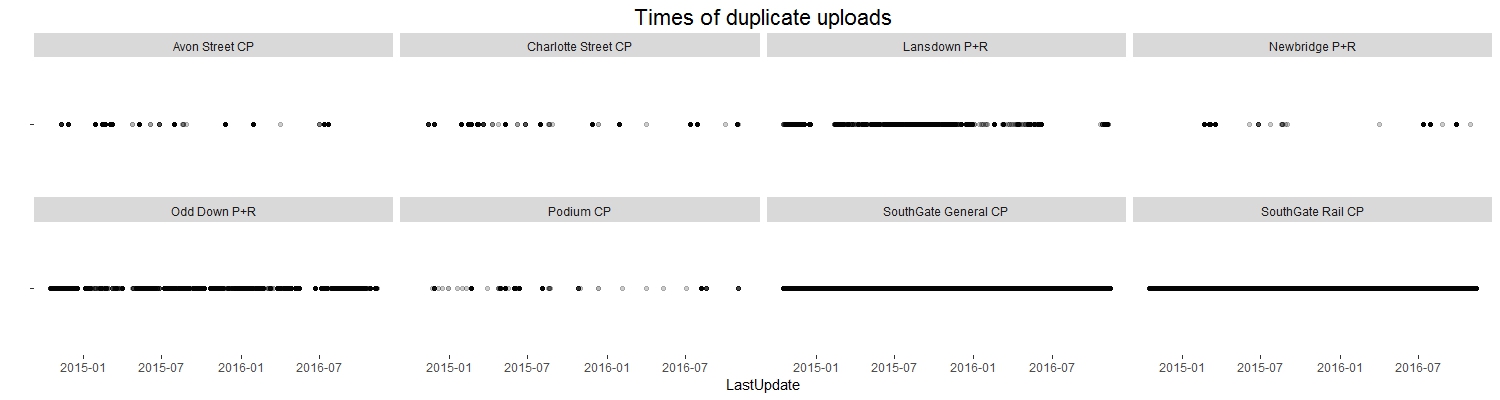
We can see that duplicates are recorded almost constantly at the SouthGate car parks, very often at the Odd Down and Lansdown P+Rs and then less frequently but seemingly at random in the other car parks.
Day 20 (01/12/16): Delay between update and upload
For the majority of this project I have been working with df, a trimmed-down version of the original dataframe which I created in the first week or so.
One of the columns I cut when I created df was DateUploaded: which is, of course, the time when a record was uploaded to the database.
Perhaps there are some interesting features to find in this column though…
For example, what is the delay in between a record being taken, and it being uploaded?
```r# Read in the original dataframe again df0 <- read.csv(“C:/Users/Owen/Documents/Coding/Parking/data/BANES_Historic_Car_Park_Occupancy.csv”)
library(dplyr) library(lubridate)
df1 <- df0 %>% select(Name, LastUpdate, DateUploaded) %>% mutate(LastUpdate = as.POSIXct(LastUpdate, tz = “UTC”, format = “%d/%m/%Y %I:%M:%S %p”), DateUploaded = as.POSIXct(DateUploaded, tz = “UTC”, format = “%d/%m/%Y %I:%M:%S %p”)) %>% mutate(Delay = as.numeric(DateUploaded - LastUpdate))
library(ggplot2)
p <- ggplot(df1, aes(x = Delay)) + geom_histogram(colour = “black”, bins = 40) + ggtitle(“Delay between update and upload”) + xlab(“Seconds”) + ylab(“Number of records”)
p<img src="day20.jpeg" /> <p>So the vast majority of the records are uploaded pretty quickly. But there is a suspicious black line along the bottom of the plot…</p> <p>Let’s replot using a log scale.</p>rp + scale_y_log10()``` 
So we actually have quite a lot of records where the delay between update and upload is fairly large - over 300000 seconds (about 3.5 days) in some cases. There are also a significant number of records which were somehow uploaded BEFORE they were recorded.