Day 26 (07/12/16): Mean occupancy by weekday revisited
We’re on the home straight!
Partly due to lack of time, partly due to lack of new ideas, and mostly because I want to, I am going to spend the last five days of this project revisiting some of the earlier plots I made, tidying them up and using cleaned data.
Let’s make this “cleaned data” - having spent the last couple of weeks looking at what makes the data messy, I’m now in a much better position to do this than I would have been at the start!
rdf1 <- select(df0, Name, LastUpdate, DateUploaded, Capacity, Occupancy, Percentage, Status) %>% mutate(LastUpdate = as.POSIXct(LastUpdate, format = "%d/%m/%Y %I:%M:%S %p"), DateUploaded = as.POSIXct(DateUploaded, format = "%d/%m/%Y %I:%M:%S %p")) %>% # Cleaning: # Remove single (?) row with NA filter(!is.na(LastUpdate)) %>% # Remove "strange" occupancies ("strange" is arbitrary...) filter(Occupancy > -100) %>% filter(Percentage < 110) %>% # Remove duplicates group_by(Name, LastUpdate) %>% slice(1L) %>% ungroup()
I’ll start by replotting Day 04. This time around I will use dplyr rather than base functions to prepare the data. I’ll also make sure to include an x-axis on each plot, and I won’t have any issues with my faceting this time either!
```rdf2 <- select(df1, Name, Percentage, LastUpdate) %>% filter(Name != “test car park”) %>% mutate(Time = (hour(LastUpdate) + round(minute(LastUpdate), -1)/60), Day = wday(LastUpdate, label = TRUE)) %>% group_by(Name, Day, Time) %>% summarize(X = mean(Percentage))
p <- ggplot(df2, aes(x = Time, y = X)) + geom_line(aes(colour = Name)) + facet_wrap(~ Day, nrow = 2, scales = “free_x”) + ggtitle(“Mean occupancy by weekday”) + labs(y = “Percentage occupancy”, x = “Time (hour)”) + theme(plot.title = element_text(size = rel(1.8))) + guides(colour = guide_legend(override.aes = list(size = 3))) p```

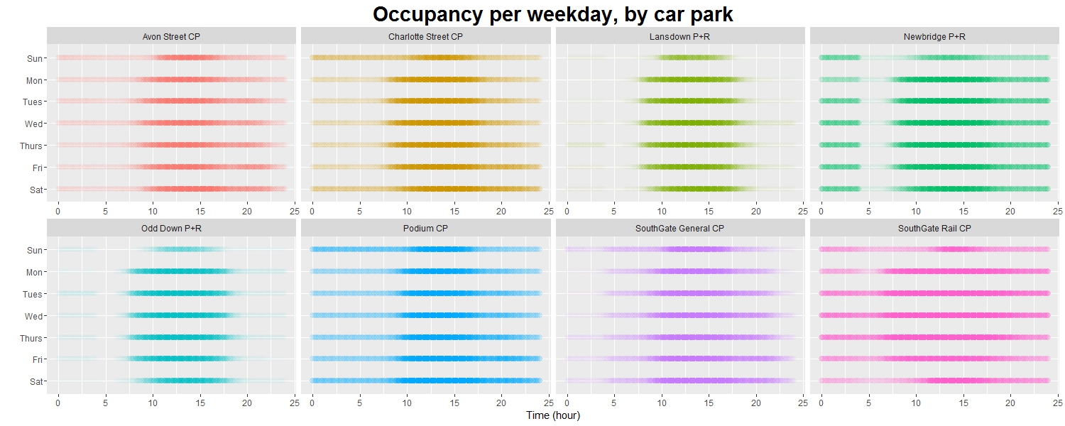
Day 27 (08/12/16): Occupancy per weekday by car park, revisited
Revisiting Day 05. The alpha levels are scaled much better now there are no outlying data points.
rp <- ggplot(data = df2, aes(Time, y = Day)) + facet_wrap(~ Name, nrow = 2, scales = "free_x") + geom_point(aes(colour = Name, alpha = X), shape = 20, size = 4) + guides(colour = guide_legend(override.aes = list(size = 3))) + scale_alpha(range = c(0, 1)) + scale_y_discrete(limits = rev(levels(df2$Day))) + labs(x = "Time (hour)", y = "") + ggtitle("Occupancy per weekday, by car park") + theme(plot.title = element_text(size = 22, face = "bold"), legend.position = "None") p
Day 28 (09/12/16): Status by weekday, revisited
Again, just tidying up a little and using the clean data.
```rlibrary(lubridate) library(reshape2) library(scales)
df2 <- select(df1, Name, LastUpdate, Status) %>% filter(Name != “test car park”) %>% mutate(Day = wday(LastUpdate, label = TRUE)) %>% group_by(Name, Day) %>% summarize(Filling = sum(Status == “Filling”) / n(), Static = sum(Status == “Static”) / n(), Emptying = sum(Status == “Emptying”) / n()) %>% melt()
p <- ggplot(df2, aes(x = Day, y = value, fill = variable)) + geom_bar(stat = “identity”) + coord_flip() + facet_wrap(~ Name, nrow = 2) + scale_fill_manual(values = c(“#FF4444”, “#AAAAAA”, “#6666FF”)) + scale_x_discrete(limits = rev(levels(df2$Day))) + scale_y_continuous(labels = percent) + labs(y = “Percent of records”, x = “Day”, fill = ““) + ggtitle(”Status by weekday”) + theme(plot.title = element_text(size = 22, face = “bold”)) p```
Day 29 (10/12/16): Mean percentage occupancy by week, revisited
Revisiting Day 09. The lines are, generally speaking, a little smoother now.
```rdf2 <- select(df1, Name, LastUpdate, Percentage) %>% filter(Name != “test car park”) %>% mutate(Week = week(LastUpdate)) %>% group_by(Name, Week) %>% summarize(meanP = mean(Percentage))
maxP <- top_n(df2, n = 1)
p <- ggplot(df2, aes(x = Week, y = meanP)) + geom_line() + facet_wrap(~ Name, nrow = 2) + geom_label(data = maxP, aes(x = Week, y = meanP + 10, label = Week)) + ggtitle(“Mean percentage occupancy per week”) + ylab(“Percentage”) + theme(plot.title = element_text(size = 22, face = “bold”)) p```
Day 30 (11/12/16): The End
Well, here I am. One month later.
This has probably been the hardest project I’ve attempted to date.
I say that not because the learning has been particularly challenging, although obviously I was learning ‘on-the-go’.
It’s tempting to say that the most difficult aspect was coming up with new ideas and new ways to explore a pretty limited set of data. In a way it is fortunate that there were so many messy and anomalous records to explore, or I would have been running out of ideas within two weeks.
But actually, the hardest thing about this project was finding the time and motivation each day to spend a couple of hours, an hour, even 20 minutes working on it - when really, true (as per usual!) to this website’s general theme, I should have been doing other things.
Having said that, I’ve done it! I stuck with it. I have (approximately) 30 plots to prove it, as well as a much better command of ggplot and dplyr for manipulating and visualizing data in the future. And hopefully some of the knowledge I’ve gained about the dataset will come in useful for the Bath ML Meetup project.
I thought I’d round off by sharing some of my ideas and doodles from when I was just starting out.
I’m now facing a busy month or two of revision and exams, so I can’t say for sure when my next project will materialize (to be truthful they tend to be fairly spontaneous anyway…) - so until then, fare thee all well, and best wishes for the remainder of 2016 and for the New Year.